8
Causal Modeling
In cities throughout the United States, the difficulty of escaping poverty is exacerbated by the difficulty in obtaining social services such as job training, mental health care, financial education classes, legal advice, child care support, and emergency food assistance. They are offered by different agencies in disparate locations with different eligibility requirements. It is difficult for poor individuals to navigate this perplexity and avail themselves of services that they are entitled to. To counteract this situation, the (fictional) integrated social service provider ABC Center takes a holistic approach by housing many individual social services in one place and having a centralized staff of social workers guide their clients. To better advise clients on how to advance themselves in various aspects of life, the center’s director and executive staff would like to analyze the data that the center collects on the services used by clients and the life outcomes they achieved. As problem owners, they do not know what sort of data modeling they should do. Imagine that you are a data scientist collaborating with the ABC Center problem owners to analyze the situation and suggest appropriate problem specifications, understand and prepare the data available, and finally perform modeling. (This chapter covers a large part of the machine learning lifecycle whereas other chapters so far have mostly focused on smaller parts.)
Your first instinct may be to suggest that ABC Center take a machine learning approach that predicts life outcomes (education, housing, employment, etc.) from a set of features that includes classes taken and sessions attended. Examining the associations and correlations in the resulting trained model may yield some insights, but misses something very important. Do you know what it is? It’s causality! If you use a standard machine learning formulation of the problem, you can’t say that taking an automobile repair training class causes an increase in the wages of the ABC Center client. When you want to understand the effect of interventions (specific actions that are undertaken) on outcomes, you have to do more than machine learning, you have to perform causal modeling.[1] Cause and effect are central to understanding the world, but standard supervised learning is not a method for obtaining them.
Toward the goal of suggesting problem formulations to ABC Center, understanding the relevant data, and creating models for them, in this chapter you will:
§ distinguish a situation as requiring a causal model or a typical predictive machine learning model,
§ discover the graph structure of causal relations among all random variables in a system, and
§ compute the quantitative causal effect of an intervention on an outcome, including from observational data.
8.1 Contrasting Causal Modeling and Predictive Modeling
If an ABC Center client completes a one-on-one counseling session, it may cause a change in their level of anxiety. In contrast, completing the sessions does not cause an increase in, say, the price of eggs even if the price of eggs suddenly jumps the day after every client’s counseling session as the price is unrelated to ABC Center. In addition, two different things can cause the same result: both counseling sessions and an increase in wages can cause a reduction in anxiety. You can also be fooled by the common cause fallacy: a client secures stable housing and then purchases a used car. The stable housing does not cause the car purchase, but both are caused by a wage increase.
But what is this elusive notion called causality? It is not the same as correlation, the ability to predict, or even statistical dependence. Remember how we broke down the meanings of trustworthiness and safety into smaller components (in Chapter 1 and Chapter 3, respectively)? Unfortunately, we cannot do the same for causality since it is an elementary concept that cannot be broken down further. The basic definition of causality is: if doing something makes something else happen, then the something we did is a cause of the something that happened. The key word in the statement is do. Causation requires doing. The actions that are done are known as interventions or treatments. Interventions can be done by people or by nature; the focus in this chapter is on interventions done consciously by people.
“While probabilities encode our beliefs about a static world, causality tells us whether and how probabilities change when the world changes, be it by intervention or by act of imagination.”
—Judea Pearl, computer scientist at University of California, Los Angeles
8.1.1 Structural Causal Models
A causal model is a quantitative attempt at capturing notions of causality among random variables that builds upon probability theory. Structural causal models are one key approach for causal modeling. They contain two parts: a causal graph (a graphical model like the Bayesian networks we went over in Chapter 3) and structural equations. As shown in Figure 8.1, the graph for both counseling sessions and a change in wages causing a change in anxiety is made up of three nodes arranged in a common effect motif: counseling à anxiety ß wages. The graph for increased wages causing stable housing and car purchase is also made up of three nodes, but arranged in the common cause motif: housing ß wages à car. The graph in the figure puts both subgraphs together along with another common cause: having access to child care causing both wages and stable housing. (If a client has child care, they can more easily search for jobs and places to live since they don’t have to take their child around with them.)
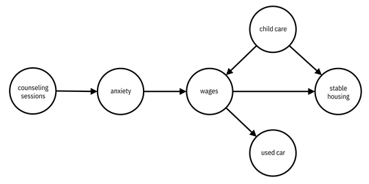
Figure 8.1. An example causal graph of how the clients of ABC Center respond to interventions and life changes. Accessible caption. A graph with six nodes: counseling sessions, anxiety, wages, child care, used car, and stable housing. There are edges from counseling sessions to anxiety, anxiety to wages, wages to used car, wages to stable housing, and child care to both wages and stable housing.
Nodes
represent random variables in structural causal models just as they do in
Bayesian networks. However, edges don’t just represent statistical dependencies,
they also represent causal relationships. A directed edge from random variable ![]() (e.g. counseling
sessions) to
(e.g. counseling
sessions) to ![]() (e.g. anxiety) indicates
a causal effect of
(e.g. anxiety) indicates
a causal effect of ![]() (counseling
sessions) on
(counseling
sessions) on ![]() (anxiety). Since
structural causal models are a generalization of Bayesian networks, the Bayesian
network calculations for representing probabilities in factored form and for determining
conditional independence through d-separation continue to hold. However, structural
causal models capture something more than the statistical relationships because
of the structural equations.
(anxiety). Since
structural causal models are a generalization of Bayesian networks, the Bayesian
network calculations for representing probabilities in factored form and for determining
conditional independence through d-separation continue to hold. However, structural
causal models capture something more than the statistical relationships because
of the structural equations.
Structural
equations, also known as functional models, tell you
what happens when you do something. Doing or
intervening is the act of forcing a random variable to take a certain value.
Importantly, it is not just passively observing what happens to all the random
variables when the value of one of them has been revealed—that is simply a
conditional probability. Structural causal modeling requires a new operator ![]() , which indicates
an intervention. The interventional distribution
, which indicates
an intervention. The interventional distribution ![]() is the
distribution of the random variable
is the
distribution of the random variable ![]() when the random
variable
when the random
variable ![]() is forced to take
value
is forced to take
value ![]() . For a causal
graph with only two nodes
. For a causal
graph with only two nodes ![]() (counseling
session) and
(counseling
session) and ![]() (anxiety) with a
directed edge from
(anxiety) with a
directed edge from ![]() to
to ![]() ,
, ![]() à
à ![]() , the structural
equation takes the functional form:
, the structural
equation takes the functional form:
![]()
Equation 8.1
where
![]() is some noise or
randomness in
is some noise or
randomness in ![]() and
and ![]() is any function. There
is an exact equation relating an intervention on counseling sessions, like
starting counseling sessions (changing the variable from
is any function. There
is an exact equation relating an intervention on counseling sessions, like
starting counseling sessions (changing the variable from ![]() to
to ![]() ), to the
probability of a client’s anxiety. The key point is that the probability can
truly be expressed as an equation with the treatment as an argument on the
right-hand side. Functional models for variables with more parents would have
those parents as arguments in the function
), to the
probability of a client’s anxiety. The key point is that the probability can
truly be expressed as an equation with the treatment as an argument on the
right-hand side. Functional models for variables with more parents would have
those parents as arguments in the function ![]() , for example
, for example ![]() if
if ![]() has three parents.
(Remember from Chapter 3 that directed edges begin at parent nodes and end at
child nodes.)
has three parents.
(Remember from Chapter 3 that directed edges begin at parent nodes and end at
child nodes.)
8.1.2 Causal Model vs. Predictive Model
How do you tell that a problem is asking for a causal model rather than a predictive model that would come from standard supervised machine learning? The key is identifying whether something is actively changing one or more of the features. The act of classifying borrowers as good bets for a loan does not change anything about the borrowers at the time, and thus calls for a predictive model (also known as an associational model) as used by ThriveGuild in Chapter 3 and Chapter 6. However, wanting to understand if providing job training to a client of ABC Center (actively changing the value of a feature on job preparedness) results in a change to their probability of being approved by ThriveGuild is a causal modeling question.
Using predictive models to form causal conclusions can lead to great harms. Changes to input features of predictive models do not necessarily lead to desired changes of output labels. All hell can break loose if a decision maker is expecting a certain input change to lead to a certain output change, but the output simply does not change or changes in the opposite direction. Because ABC Center wants to model what happens to clients upon receiving social services, you should suggest to the director that the problem specification be focused on causal models to understand the center’s set of interventions (various social services) and outcomes that measure how well a client is progressing out of poverty.
An important point is that even if a model is only going to be used for prediction, and not for making decisions to change inputs, causal models help sidestep issues introduced in Chapter 4—construct validity (the data really measures with it should), internal validity (no errors in data processing), and external validity (generalization to other settings)—because it forces the predictions to be based on real, salient phenomena rather than spurious phenomena that just happen to exist in a given dataset. For this reason, causality is an integral component of trustworthy machine learning, and comes up in Part 4 of the book that deals with reliability. Settling for predictive models is a shortcut when just a little more effort to pursue causal models would make a world of difference.
8.1.3 Two Problem Formulations
There
are two main problem formulations in causal modeling for ABC Center to consider
in the problem specification phase of the development lifecycle. The first is
obtaining the structure of the causal graph, which will allow them to understand
which services yield effects on which outcomes. The second problem formulation is
obtaining a number that quantifies the causal effect between a given treatment
variable ![]() (maybe it is
completing the automobile repair class) and a given outcome label
(maybe it is
completing the automobile repair class) and a given outcome label ![]() (maybe it is
wages). This problem is described further in Section 8.2.
(maybe it is
wages). This problem is described further in Section 8.2.
Proceeding to the data understanding and data preparation phases of the lifecycle, there are two types of data, interventional data and observational data, that may come up in causal modeling. They are detailed in Section 8.3. Very briefly, interventional data comes from a purposefully designed experiment and observational data does not. Causal modeling with interventional data is usually straightforward and causal modeling with observational data is much more involved.
In the modeling phase when dealing with observational data, the two problem formulations correspond to two different categories of methods. Causal discovery is to learn the structural causal model. Causal inference is to estimate the causal effect. Specific methods for conducting causal discovery and causal inference from observational data are the topic of Sections 8.4 and 8.5, respectively. A mental model of the modeling methods for the two formulations is given in Figure 8.2.
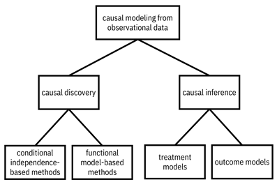
Figure 8.2. Classes of methods for causal modeling from observational data. Accessible caption. A hierarchy diagram with causal modeling from observational data at its root with children causal discovery and causal inference. Causal discovery has children conditional independence-based methods and functional model-based methods. Causal inference has children treatment models and outcome models.
8.2 Quantifying a Causal Effect
The
second problem specification is computing the average
treatment effect. For simplicity, let’s focus on ![]() being a binary
variable taking values in
being a binary
variable taking values in ![]() : either a client
doesn’t get the automobile repair class or they do. Then the average treatment
effect
: either a client
doesn’t get the automobile repair class or they do. Then the average treatment
effect ![]() is:
is:
![]()
Equation 8.2
This difference of the expected value of the outcome label under the two values of the intervention precisely shows how the outcome changes due to the treatment. How much do wages change because of the automobile repair class? The terminology contains average because of the expected value.
For
example, if ![]() is a Gaussian
random variable with mean
is a Gaussian
random variable with mean ![]() and standard
deviation
and standard
deviation ![]() ,[2]
and
,[2]
and ![]() is a Gaussian
random variable with mean
is a Gaussian
random variable with mean ![]() and standard
deviation
and standard
deviation ![]() , then the average
treatment effect is
, then the average
treatment effect is ![]() . Being trained in
automobile repair increases the earning potential of clients by
. Being trained in
automobile repair increases the earning potential of clients by ![]() . The standard
deviation doesn’t matter here.
. The standard
deviation doesn’t matter here.
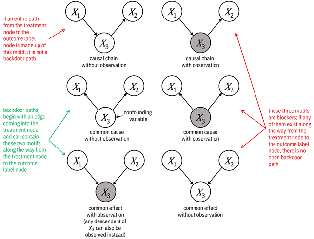
Figure 8.3. Motifs that block and do not block paths
between the treatment node ![]() and the outcome
label node
and the outcome
label node ![]() . Backdoor paths
are not blocked. Accessible caption. If an entire path is made up of causal
chains without observation (
. Backdoor paths
are not blocked. Accessible caption. If an entire path is made up of causal
chains without observation (![]() à
à ![]() à
à ![]() ), it is not a
backdoor path. Backdoor paths begin with an edge coming into the treatment node
and can contain common causes without observation (
), it is not a
backdoor path. Backdoor paths begin with an edge coming into the treatment node
and can contain common causes without observation (![]() ß
ß ![]() à
à ![]() is a confounding
variable) and common effects with observation (
is a confounding
variable) and common effects with observation (![]() à
à ![]() ß
ß ![]() ; the underline
indicates that
; the underline
indicates that ![]() or any of its
descendants is observed). In this case,
or any of its
descendants is observed). In this case, ![]() in the common
cause without observation is a confounding variable. The other three
motifs—causal chain with observation (
in the common
cause without observation is a confounding variable. The other three
motifs—causal chain with observation (![]() à
à ![]() à
à ![]() ), common cause
with observation (
), common cause
with observation (![]() ß
ß ![]() à
à ![]() ), and common
effect without observation (
), and common
effect without observation (![]() à
à ![]() ß
ß ![]() )—are blockers. If
any of them exist along the way from the treatment to the outcome label, there
is no open backdoor path.
)—are blockers. If
any of them exist along the way from the treatment to the outcome label, there
is no open backdoor path.
8.2.1 Backdoor Paths and Confounders
It
is important to note that the definition of the average treatment effect is
conditioned on ![]() , not on
, not on ![]() , and that
, and that ![]() and
and ![]() are generally not
the same. Specifically, they are not the same when there is a so-called backdoor path between
are generally not
the same. Specifically, they are not the same when there is a so-called backdoor path between![]() and
and ![]() . Remember that a
path is a sequence of steps along edges in the graph, irrespective of their
direction. A backdoor path is any path from
. Remember that a
path is a sequence of steps along edges in the graph, irrespective of their
direction. A backdoor path is any path from ![]() to
to ![]() that (1) starts with
an edge going into
that (1) starts with
an edge going into ![]() and (2) is not
blocked. The reason for the name ‘backdoor’ is because the first edge goes
backwards into
and (2) is not
blocked. The reason for the name ‘backdoor’ is because the first edge goes
backwards into ![]() . (Frontdoor paths have
the first edge coming out of
. (Frontdoor paths have
the first edge coming out of ![]() .) Recall from Chapter
3 that a path is blocked if it contains:
.) Recall from Chapter
3 that a path is blocked if it contains:
1. a causal chain motif with the middle node observed, i.e. the middle node is conditioned upon,
2. a common cause motif with the middle node observed, or
3. a common effect motif with the middle node not observed (this is a collider)
anywhere
between ![]() and
and ![]() . Backdoor paths can contain (1) the common cause without observation motif
and (2) the common effect with observation motif between
. Backdoor paths can contain (1) the common cause without observation motif
and (2) the common effect with observation motif between ![]() and
and ![]() . The motifs that
block and do not block a path are illustrated in Figure 8.3.
. The motifs that
block and do not block a path are illustrated in Figure 8.3.
The
lack of equality between the interventional distribution ![]() and the
associational distribution
and the
associational distribution ![]() is known as confounding bias.[3]
Any middle nodes of common cause motifs along a backdoor path are confounding variables or confounders.
Confounding is the central challenge to be overcome when you are trying to
infer the average treatment effect in situations where intervening is not
possible (you cannot
is known as confounding bias.[3]
Any middle nodes of common cause motifs along a backdoor path are confounding variables or confounders.
Confounding is the central challenge to be overcome when you are trying to
infer the average treatment effect in situations where intervening is not
possible (you cannot ![]() ). Section 8.5
covers how to mitigate confounding while estimating the average treatment
effect.
). Section 8.5
covers how to mitigate confounding while estimating the average treatment
effect.
8.2.2 An Example
Figure 8.4 shows an example of using ABC Center’s causal graph (introduced in Figure 8.1) while quantifying a causal effect. The center wants to test whether reducing a client’s high anxiety to low anxiety affects their stable housing status. There is a backdoor path from anxiety to stable housing going through wages and child care. The path begins with an arrow going into anxiety. A common cause without observation, wages ß child care à stable housing, is the only other motif along the path to stable housing. It does not block the path. Child care, as the middle node of a common cause, is a confounding variable. If you can do the treatment, that is intervene on anxiety, which is represented diagrammatically with a hammer, the incoming edges to anxiety from counseling sessions and wages are removed. Now there is no backdoor path anymore, and you can proceed with the treatment effect quantification.
Often, however, you cannot do the treatment. These are observational rather than interventional settings. The observational setting is a completely different scenario than the interventional setting. Figure 8.5 shows how things play out. Since you cannot make the edge between anxiety and wages go away through intervention, you have to include the confounding variable of whether the client has child care or not in your model, and only then will you be able to do a proper causal effect quantification between anxiety and stable housing. Including, observing, or conditioning upon confounding variables is known as adjusting for them. Adjusting for wages rather than child care is an alternative way to block the backdoor path in the ABC Center graph.
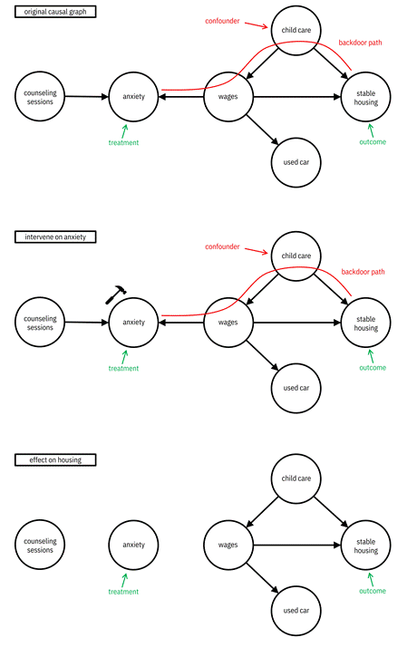
Figure 8.4. The scenario of causal effect quantification when you can intervene on the treatment. Accessible caption. The causal graph of Figure 8.1 is marked with anxiety as the treatment and stable housing as the outcome. A backdoor path is drawn between the two passing through wages and child care, which is marked as a confounder. Intervening on anxiety is marked with a hammer. Its effect is the removal of edges into anxiety from counseling sessions and wages, and the removal of the backdoor path.
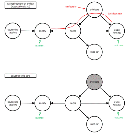
Figure 8.5. The scenario of causal effect quantification when you cannot intervene on the treatment and thus have to adjust for a variable along a backdoor path. Accessible caption. The causal graph of Figure 8.1 is marked with anxiety as the treatment and stable housing as the outcome. A backdoor path is drawn between the two passing through wages and child care, which is marked as a confounder. Adjusting for child care colors its node gray and removes the backdoor path.
At the end of the day, the whole point of computing causal effects is to inform decision making. If there are two competing social services that ABC Center can offer a client, causal models should recommend the one with the largest effect on the outcome that they care about. In the next sections, you will proceed to find models for this task from data.
8.3 Interventional Data and Observational Data
You have worked with the director of ABC Center on the problem specification phase and decided on a causal modeling approach rather than a standard machine learning approach for giving insights on interventions for clients to achieve good life outcomes. You have also decided on the specific form of causal modeling: either obtaining the structural causal model or the average treatment effect. The next phases in the machine learning lifecycle are data understanding and data preparation.
There are two types of data in causal modeling: interventional data and observational data, whose settings you have already been exposed to in the previous section. Interventional data is collected when you actually do the treatment. It is data collected as part of an experiment that has already been thought out beforehand. An experiment that ABC Center might conduct to obtain interventional data is to enroll one group of clients in a financial education seminar and not enroll another group of clients. The group receiving the treatment of the financial education seminar is the treatment group and the group not receiving the seminar is the control group. ABC Center would collect data about those clients along many feature dimensions, and this would constitute the dataset to be modeled in the next phase of the lifecycle. It is important to collect data for all features that you think could possibly be confounders.
As
already seen in the previous sections and irrespective of whether collected
interventionally or observationally, the random variables are: the treatment ![]() that designates
the treatment and control groups (anxiety intervention), the outcome label
that designates
the treatment and control groups (anxiety intervention), the outcome label ![]() (stable housing),
and other features
(stable housing),
and other features ![]() (child care and
others). A collection of samples from these random variables constitute the
dataset in average treatment effect estimation:
(child care and
others). A collection of samples from these random variables constitute the
dataset in average treatment effect estimation: ![]() . An example of
such a dataset is shown in Figure 8.6. In estimating a structural causal model,
you just have random variables
. An example of
such a dataset is shown in Figure 8.6. In estimating a structural causal model,
you just have random variables ![]() and designate a
treatment and outcome label later if needed.
and designate a
treatment and outcome label later if needed.
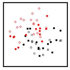
Figure 8.6. A dataset for treatment effect estimation. The
axes are two feature dimensions of ![]() . The unfilled data
points are the control group
. The unfilled data
points are the control group ![]() and the filled
data points are the treatment group
and the filled
data points are the treatment group ![]() . The diamond data
points have the outcome label
. The diamond data
points have the outcome label ![]() and the square data
points have the outcome label
and the square data
points have the outcome label ![]() .
.
The causal graph can be estimated from the entire data if the goal of ABC Center is to get a general understanding of all of the causal relationships. Alternatively, causal effects can be estimated from the treatment, confounding, and outcome label variables if the director wants to test a specific hypothesis such as anxiety reduction seminars having a causal effect on stable housing. A special kind of experiment, known as a randomized trial, randomly assigns clients to the treatment group and control group, thereby mitigating confounding within the population being studied.
It
is not possible to observe both the outcome label ![]() under the control
under the control ![]() and its counterfactual
and its counterfactual ![]() under the
treatment
under the
treatment ![]() because the same
individual cannot both receive and not receive the treatment at the same time.
This is known as the fundamental problem of causal modeling.
The fundamental problem of causal modeling is lessened by randomization because,
on average, the treatment group and control group contain matching clients that
almost look alike. Randomization does not prevent a lack of external validity however
(recall from Chapter 4 that external validity is the ability of a dataset to
generalize to a different population). It is possible that some attribute of
all clients in the population is commonly caused by some other variable that is
different in other populations.
because the same
individual cannot both receive and not receive the treatment at the same time.
This is known as the fundamental problem of causal modeling.
The fundamental problem of causal modeling is lessened by randomization because,
on average, the treatment group and control group contain matching clients that
almost look alike. Randomization does not prevent a lack of external validity however
(recall from Chapter 4 that external validity is the ability of a dataset to
generalize to a different population). It is possible that some attribute of
all clients in the population is commonly caused by some other variable that is
different in other populations.
Randomized trials are considered to be the gold standard in causal modeling that should be done if possible. Randomized trials and interventional data collection more broadly, however, are often prohibited by ethical or logistical reasons. For example, it is not ethical to withhold a treatment known to be beneficial such as a job training class to test a hypothesis. From a logistical perspective, ABC Center may not, for example, have the resources to give half its clients a $1000 cash transfer (similar to Unconditionally’s modus operandi in Chapter 4) to test the hypothesis that this intervention improves stable housing. Even without ethical or logistical barriers, it can also be the case that ABC Center’s director and executive staff think up a new cause-and-effect relationship they want to investigate after the data has already been collected.
In all of these cases, you are in the setting of observational data rather than interventional data. In observational data, the treatment variable’s value has not been forced to a given value; it has just taken whatever value it happened to take, which could be dependent on all sorts of other variables and considerations. In addition, because observational data is often data of convenience that has not been purposefully collected, it might be missing a comprehensive set of possible confounding variables.
The fundamental problem of causal modeling is very apparent in observational data and because of it, testing and validating causal models becomes challenging. The only (unsatisfying) ways to test causal models are (1) through simulated data that can produce both a factual and counterfactual data point, or (2) to collect an interventional dataset from a very similar population in parallel. Regardless, if all you have is observational data, all you can do is work with it in the modeling phase of the lifecycle.
8.4 Causal Discovery Methods
After the data understanding phase comes modeling. How do you obtain a causal graph structure for ABC Center like the one in Figure 8.1? There are three ways to proceed:[4]
1. Enlist subject matter experts from ABC Center to draw out all the arrows (causal relationships) among all the nodes (random variables) manually,
2. Design and conduct experiments to tease out causal relationships, or
3. Discover the graph structure based on observational data.
The first manual option is a good option, but it can lead to the inclusion of human biases and is not scalable to problems with a large number of variables, more than twenty or thirty. The second experimental option is also a good option, but is also not scalable to a large number of variables because interventional experiments would have to be conducted for every possible edge. The third option, known as causal discovery, is the most tractable in practice and what you should pursue with ABC Center.[5]
You’ve probably heard the phrase “those who can, do; those who can’t, teach” which is shortened to “those who can’t do, teach.” In causal modeling from observational data when you can’t intervene, the phrase to keep in mind is “those who can’t do, assume.” Causal discovery has two branches, shown back in Figure 8.2, each with a different assumption that you need to make. The first branch is based on conditional independence testing and relies on the faithfulness assumption. The main idea of faithfulness is that the conditional dependence and independence relationships among the random variables encode the causal relationships. There is no coincidental or deterministic relationship among the random variables that masks a causal relationship. The Bayesian network edges are the edges of the structural causal model. Faithfulness is usually true in practice.
One probability distribution can be factored in many ways by choosing different sets of variables to condition on, which leads to different graphs. Arrows pointing in different directions also lead to different graphs. All of these different graphs arising from the same probability distribution are known as a Markov equivalence class. One especially informative example of a Markov equivalence class is the setting with just two random variables, say anxiety and wages.[6] The graph with anxiety as the parent and wages as the child and the graph with wages as the parent and anxiety as the child lead to the same probability distribution, but with opposite cause-and-effect relationships. One important point about the conditional independence testing branch of causal discovery methods is that they find Markov equivalence classes of graph structures rather than finding single graph structures.
The
second branch of causal discovery is based on making assumptions on the form of
the structural equations ![]() introduced in Equation
8.1. Within this branch, there are several different varieties. For example, some
varieties assume that the functional model has a linear function
introduced in Equation
8.1. Within this branch, there are several different varieties. For example, some
varieties assume that the functional model has a linear function ![]() , others assume
that the functional model has a nonlinear function
, others assume
that the functional model has a nonlinear function ![]() with additive
noise
with additive
noise ![]() , and even others assume
that the probability distribution of the noise
, and even others assume
that the probability distribution of the noise ![]() has small entropy.
Based on the assumed functional form, a best fit to the observational data is
made. The assumptions in this branch are much stronger than in conditional
independence testing, but lead to single graphs as the solution rather than
Markov equivalence classes. These characteristics are summarized in Table 8.1.
has small entropy.
Based on the assumed functional form, a best fit to the observational data is
made. The assumptions in this branch are much stronger than in conditional
independence testing, but lead to single graphs as the solution rather than
Markov equivalence classes. These characteristics are summarized in Table 8.1.
Table 8.1. Characteristics of the two branches of causal discovery methods.
|
Branch |
Faithfulness |
Assumption on Functional Model |
Markov Equivalence Class Output |
Single Graph Output |
|
conditional |
X |
|
X |
|
|
functional model |
|
X |
|
X |
In the remainder of this section, you’ll see an example of each branch of causal discovery in action: the PC algorithm for conditional independence testing-based methods and the additive noise model-based approach for functional model-based methods.
8.4.1 An Example Conditional Independence Testing-Based Method
One of the oldest, simplest, and still often-used conditional independence testing-based causal discovery methods is the PC algorithm. Named for its originators, Peter Spirtes and Clark Glymour, the PC algorithm is a greedy algorithm. An ABC Center example of the PC algorithm is presented in Figure 8.7 for the nodes of wages, child care, stable housing, and used car. The steps are as follows:
4. The overall PC algorithm starts with a complete undirected graph with edges between all pairs of nodes.
1. As a first step, the algorithm tests every pair of nodes; if they are independent, it deletes the edge between them. Next it continues to test conditional independence for every pair of nodes conditioning on larger and larger subsets, deleting the edge between the pair of nodes if any conditional independence is found. The end result is the undirected skeleton of the causal graph.
The reason for this first step is as follows. There is an
undirected edge between nodes ![]() and
and ![]() if and only if
if and only if ![]() and
and ![]() are dependent
conditioned on every possible subset of all other nodes. (So if a graph has
three other nodes
are dependent
conditioned on every possible subset of all other nodes. (So if a graph has
three other nodes ![]() ,
, ![]() , and
, and ![]() , then you’re
looking for
, then you’re
looking for ![]() and
and ![]() to be (1)
unconditionally dependent given no other variables, (2) dependent given
to be (1)
unconditionally dependent given no other variables, (2) dependent given ![]() , (3) dependent
given
, (3) dependent
given ![]() , (4) dependent
given
, (4) dependent
given ![]() , (5) dependent
given
, (5) dependent
given ![]() , (6) dependent
given
, (6) dependent
given ![]() , (7) dependent given
, (7) dependent given
![]() , and (8) dependent
given
, and (8) dependent
given ![]() .) These
conditional dependencies can be figured out using d-separation, which was
introduced back in Chapter 3.
.) These
conditional dependencies can be figured out using d-separation, which was
introduced back in Chapter 3.
2. The second step puts arrowheads on as many edges as it can. The algorithm conducts conditional independence tests between the first and third nodes of three-node chains. If they’re dependent conditioned on some set of nodes containing the middle node, then a common cause (collider) motif with arrows is created. The end result is a partially-oriented causal graph. The direction of edges that the algorithm cannot figure out remain unknown. All choices of all of those orientations give you the different graphs that make up the Markov equivalence class.
The reason for the second step is that an undirected chain of
nodes ![]() ,
, ![]() , and
, and ![]() can be made
directed into
can be made
directed into ![]() à
à ![]() ß
ß ![]() if and only if
if and only if ![]() and
and ![]() are dependent
conditioned on every possible subset of nodes containing
are dependent
conditioned on every possible subset of nodes containing ![]() . These conditional
dependencies can also be figured out using d-separation.
. These conditional
dependencies can also be figured out using d-separation.
At the end of the example in Figure 8.7, the Markov equivalence class contains four possible graphs.
In Chapter 3, d-separation was presented in the ideal case when you know the dependence and independence of each pair of random variables perfectly well. But when dealing with data, you don’t have that perfect knowledge. The specific computation you do on data to test for conditional independence between random variables is often based on an estimate of the mutual information between them. This seemingly straightforward problem of conditional independence testing among continuous random variables has a lot of tricks of the trade that continue to be researched and are beyond the scope of this book.[7]
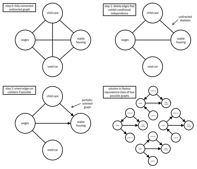
Figure 8.7. An example of the steps of the PC algorithm. Accessible caption. In step 0, there is a fully connected undirected graph with the nodes child care, wages, stable housing, and used car. In step 1, the edges between child care and used car, and between stable housing and used car have been removed because they exhibit conditional independence. The undirected skeleton is left. In step 2, the edge between child care and stable housing is oriented to point from child care to stable housing, and the edge between wages and stable housing is oriented to point from wages to stable housing. The edges between child care and wages and between wages and used car remain undirected. This is the partially-oriented graph. There are four possible directed graphs which constitute the Markov equivalence class solution: with edges pointing from child care to wages and used car to wages, with edges pointing from child care to wages and wages to used car, with edges pointing from wages to child care and from used care to wages, and with edges poiting from wages to child care and wages to used car.
8.4.2 An Example Functional Model-Based Method
In
the conditional independence test-based methods, no strong assumption is made
on the functional form of ![]() . Thus, as you’ve
seen with the PC algorithm, there can remain confusion on the direction of some
of the edges. You can’t tell which one of two nodes is the cause and which one
is the effect. Functional model-based methods do make an assumption on
. Thus, as you’ve
seen with the PC algorithm, there can remain confusion on the direction of some
of the edges. You can’t tell which one of two nodes is the cause and which one
is the effect. Functional model-based methods do make an assumption on ![]() and are designed
to avoid this confusion. They are best understood in the case of just two nodes,
say
and are designed
to avoid this confusion. They are best understood in the case of just two nodes,
say ![]() and
and ![]() , or wages and
anxiety. You might think that a change in wages causes a change in anxiety (
, or wages and
anxiety. You might think that a change in wages causes a change in anxiety (![]() causes
causes ![]() ), but it could be
the other way around (
), but it could be
the other way around (![]() causes
causes ![]() ).
).
One
specific method in this functional model-based branch of causal discovery
methods is known as the additive noise model. It requires
that ![]() not be a linear
function and that the noise be additive:
not be a linear
function and that the noise be additive: ![]() ; here
; here ![]() should not depend
on
should not depend
on ![]() . The plot in Figure
8.8 shows an example nonlinear function along with a quantification of the
noise surrounding the function. This noise band is equal in height around the
function for all values of
. The plot in Figure
8.8 shows an example nonlinear function along with a quantification of the
noise surrounding the function. This noise band is equal in height around the
function for all values of ![]() since the noise
does not depend on
since the noise
does not depend on ![]() . Now look at
what’s going on when
. Now look at
what’s going on when ![]() is the vertical
axis and
is the vertical
axis and ![]() is the horizontal
axis. Is the noise band equal in height around the function for all values of
is the horizontal
axis. Is the noise band equal in height around the function for all values of ![]() ? It isn’t, and
that’s the key observation. The noise has constant height around the function
when the cause is the horizontal axis and it doesn’t when the effect is the
horizontal axis. There are ways to test for this phenomenon from data, but if
you understand this idea shown in Figure 8.8, you’re golden. If ABC Center
wants to figure out whether a decrease in anxiety causes an increase in wages,
or if an increase in wages causes a decrease in anxiety, you know what analysis
to do.
? It isn’t, and
that’s the key observation. The noise has constant height around the function
when the cause is the horizontal axis and it doesn’t when the effect is the
horizontal axis. There are ways to test for this phenomenon from data, but if
you understand this idea shown in Figure 8.8, you’re golden. If ABC Center
wants to figure out whether a decrease in anxiety causes an increase in wages,
or if an increase in wages causes a decrease in anxiety, you know what analysis
to do.
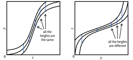
Figure 8.8. Example of using the additive noise model
method to tell cause and effect apart. Since the height of the noise band is
the same across all ![]() and different
across all
and different
across all ![]() ,
, ![]() is the cause and
is the cause and ![]() is the effect. Accessible
caption. Two plots of the same nonlinear function and noise bands around it.
The first plot has
is the effect. Accessible
caption. Two plots of the same nonlinear function and noise bands around it.
The first plot has ![]() on the vertical
axis and
on the vertical
axis and ![]() on the horizontal
axis; the second has
on the horizontal
axis; the second has ![]() on the vertical
axis and
on the vertical
axis and ![]() on the horizontal
axis. In the first plot, the height of the noise band is consistently the same
for different values of
on the horizontal
axis. In the first plot, the height of the noise band is consistently the same
for different values of ![]() . In the second
plot, the height of the noise band is consistently different for different
values of
. In the second
plot, the height of the noise band is consistently different for different
values of ![]() .
.
This phenomenon does not happen when the function is linear. Try drawing Figure 8.8 for a linear function in your mind, and then flip it around as a thought experiment. You’ll see that the height of the noise is the same both ways and so you cannot tell cause and effect apart.
8.5 Causal Inference Methods
Based
on Section 8.4, you have the tools to estimate the structure of the causal
relations among random variables collected by ABC Center. But just knowing the
relations is not enough for the director. He also wants to quantify the causal
effects for a specific treatment and outcome label. Specifically, he wants to
know what the effect of anxiety reduction is on stable housing. You now turn to
average treatment effect estimation methods to try to answer the question. You
are working with observational data because ABC Center has not run a controlled
experiment to try to tease out this cause-and-effect relationship. From Figure
8.5, you know that child care is a confounding variable, and because of proper
foresight and not taking shortcuts, you have collected data on it. The ![]() values report
those clients who received an anxiety reduction treatment, the
values report
those clients who received an anxiety reduction treatment, the ![]() values report data
on clients’ child care situation and other possible confounders, and the
values report data
on clients’ child care situation and other possible confounders, and the ![]() values are the
client’s outcome label on stable housing.
values are the
client’s outcome label on stable housing.
Remember our working phrase: “those who can’t do, assume.” Just like in causal discovery, causal inference from observational data requires assumptions. A basic assumption in causal inference is similar to the independent and identically distributed (i.i.d.) assumption in machine learning, introduced in Chapter 3. This causal inference assumption, the stable unit treatment value assumption, simply says that the outcome of one client only depends on the treatment made to that client, and is not affected by treatments to other clients. There are two important assumptions:
1.
No unmeasured confounders also known as ignorability. The dataset needs to contain all the
confounding variables within ![]() .
.
2.
Overlap also known as positivity. The probability
of the treatment ![]() given the
confounding variables must be neither equal to
given the
confounding variables must be neither equal to ![]() nor equal to
nor equal to ![]() . It must take a value
strictly greater than
. It must take a value
strictly greater than ![]() and strictly less
than
and strictly less
than ![]() . This definition
explains the name positivity because the probability has to be positive, not
identically zero. Another perspective on the assumption is that the probability
distribution of
. This definition
explains the name positivity because the probability has to be positive, not
identically zero. Another perspective on the assumption is that the probability
distribution of ![]() for the treatment
group and the probability distribution of
for the treatment
group and the probability distribution of ![]() for the control
group should overlap; there should not be any support for one of the two
distributions where there isn’t support for the other. Overlap and the lack
thereof is illustrated in Figure 8.9 using a couple of datasets.
for the control
group should overlap; there should not be any support for one of the two
distributions where there isn’t support for the other. Overlap and the lack
thereof is illustrated in Figure 8.9 using a couple of datasets.
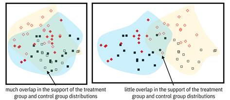
Figure 8.9. On the left, there is much overlap in the support of the treatment and control groups, so average treatment effect estimation is possible. On the right, there is little overlap, so average treatment effect estimation should not be pursued. Accessible caption. Plots with data points from the treatment group and control group overlaid with regions indicating the support of their underlying distributions. In the left plot, there is much overlap in the support and in the right plot, there isn’t.
Both assumptions together go by the name strong ignorability. If the strong ignorability assumptions are not true, you should not conduct average treatment effect estimation from observational data. Why are these two assumptions needed and why are they important? If the data contains all the possible confounding variables, you can adjust for them to get rid of any confounding bias that may exist. If the data exhibits overlap, you can manipulate or balance the data to make it look like the control group and the treatment group are as similar as can be.
If you’ve just been given a cleaned and prepared version of ABC Center’s data to perform average treatment effect estimation on, what are your next steps? There are four tasks for you to do in an iterative manner, illustrated in Figure 8.10. The first task is to specify a causal method, choosing between (1) treatment models and (2) outcome models. These are the two main branches of conducting causal inference from observational data and were shown back in Figure 8.2. Their details are coming up in the next subsections. The second task in the iterative approach is to specify a machine learning method to be plugged in within the causal method you choose. Both types of causal methods, treatment models and outcome models, are based on machine learning under the hood. The third task is to train the model. The fourth and final task is to evaluate the assumptions to see whether the result can really be viewed as a causal effect.[8] Let’s go ahead and run the four tasks for the ABC Center problem.
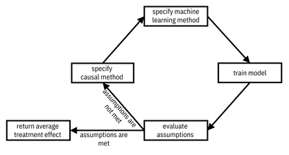
Figure 8.10. The steps to follow while conducting average treatment effect estimation from observational data. Outside of this loop, you may also go back to the data preparation phase of the machine learning lifecycle if needed. Accessible caption. A flow diagram starting with specify causal method, leading to specify machine learning method, leading to train model, leading to evaluate assumptions. If assumptions are not met, flow back to specify causal method. If assumptions are met, return average treatment effect.
8.5.1 Treatment Models
The
first option for you to consider for your causal method is treatment
models. Before diving into treatment models, let’s define an important
concept first: propensity score. It is the
probability of the treatment (anxiety reduction intervention) conditioned on
the possible confounding variables (child care and others), ![]() . Ideally, the
decision to give a client an anxiety reduction intervention is independent of
anything else, including whether the client has child care. This is true in
randomized trials, but tends not to be true in observational data.
. Ideally, the
decision to give a client an anxiety reduction intervention is independent of
anything else, including whether the client has child care. This is true in
randomized trials, but tends not to be true in observational data.
The
goal of treatment models is to get rid of confounding bias by breaking the
dependency between ![]() and
and ![]() . They do this by assigning
weights to the data points so that they better resemble a randomized trial: on average,
the clients in the control group and in the treatment group should be similar
to each other in their confounding variables. The main idea of the most common
method in this branch, inverse probability weighting,
is to give more weight to clients in the treatment group that were much more
likely to be assigned to the control group and vice versa. Clients given the
anxiety reduction treatment
. They do this by assigning
weights to the data points so that they better resemble a randomized trial: on average,
the clients in the control group and in the treatment group should be similar
to each other in their confounding variables. The main idea of the most common
method in this branch, inverse probability weighting,
is to give more weight to clients in the treatment group that were much more
likely to be assigned to the control group and vice versa. Clients given the
anxiety reduction treatment ![]() are given weight
inversely proportional to their propensity score
are given weight
inversely proportional to their propensity score ![]() . Clients not given
the treatment
. Clients not given
the treatment ![]() are similarly
weighted
are similarly
weighted ![]() which also equals
which also equals ![]() . The average
treatment effect of anxiety reduction on stable housing is then simply the
weighted mean difference of the outcome label between the treatment group and the
control group. If you define the treatment group as
. The average
treatment effect of anxiety reduction on stable housing is then simply the
weighted mean difference of the outcome label between the treatment group and the
control group. If you define the treatment group as ![]() and the control
group as
and the control
group as ![]() , then the average
treatment effect estimate is
, then the average
treatment effect estimate is
![]()
Equation 8.3
Getting
the propensity score ![]() from
training data samples
from
training data samples ![]() is
a machine learning task with features
is
a machine learning task with features ![]() and
labels
and
labels ![]() in
which you want a (calibrated) continuous score as output (the
score was called
in
which you want a (calibrated) continuous score as output (the
score was called ![]() in Chapter 6). The
learning task can be done with any of the machine learning algorithms from Chapter
7. The domains of competence of the different choices of machine learning
algorithms for estimating the propensity score are the same as for any other
machine learning task, e.g. decision forests for structured datasets and neural
networks for large semi-structured datasets.
in Chapter 6). The
learning task can be done with any of the machine learning algorithms from Chapter
7. The domains of competence of the different choices of machine learning
algorithms for estimating the propensity score are the same as for any other
machine learning task, e.g. decision forests for structured datasets and neural
networks for large semi-structured datasets.
Once you’ve trained a propensity score model, the next step is to evaluate it to see whether it meets the assumptions for causal inference. (Just because you can compute an average treatment effect doesn’t mean that everything is hunky-dory and that your answer is actually the causal effect.) There are four main evaluations of a propensity score model: (1) covariate balancing, (2) calibration, (3) overlap of propensity distribution, and (4) area under the receiver operating characteristic (AUC). Calibration and AUC were introduced in Chapter 6 as ways to evaluate typical machine learning problems, but covariate balancing and overlap of propensity distribution are new here. Importantly, the use of AUC to evaluate propensity score models is different than its use to evaluate typical machine learning problems.
Since the goal of inverse probability weighting is to make
the potential confounding variables ![]() look
alike in the treatment and control groups, the first evaluation, covariate
balancing, tests whether that has been accomplished. This is done by
computing the standardized mean difference (SMD) going one-by-one through the
look
alike in the treatment and control groups, the first evaluation, covariate
balancing, tests whether that has been accomplished. This is done by
computing the standardized mean difference (SMD) going one-by-one through the ![]() features
(child care and other possible confounders). Just subtract the mean value of
the feature for the control group data from the mean value for the treatment
group data, and divide by the square root of the average variance of the
feature for the treatment and control groups. ‘Standardized’ refers to the
division at the end, which is done so that you don’t have to worry about the
absolute scale of different features. An absolute value of SMD greater than
about
features
(child care and other possible confounders). Just subtract the mean value of
the feature for the control group data from the mean value for the treatment
group data, and divide by the square root of the average variance of the
feature for the treatment and control groups. ‘Standardized’ refers to the
division at the end, which is done so that you don’t have to worry about the
absolute scale of different features. An absolute value of SMD greater than
about ![]() for
any feature should be a source of concern. If you see this happening, your
propensity score model is not good and you shouldn’t draw causal conclusions
from the average treatment effect.
for
any feature should be a source of concern. If you see this happening, your
propensity score model is not good and you shouldn’t draw causal conclusions
from the average treatment effect.
The second evaluation is calibration. Since the propensity score model is used as an actual probability in inverse probability weighting, it has to have good calibration to be effective. Introduced in Chapter 6, the calibration loss needs to be small and the calibration curve needs to be as much of a straight line as possible. If they aren’t, you shouldn’t draw causal conclusions from the average treatment effect you compute and need to go back to step 1.
The third evaluation is based on the distributions of the propensity
score for the treatment group and the control group, illustrated in Figure 8.11.
Spikes in the distribution near ![]() or
or
![]() are
bad because they indicate a possible large set of
are
bad because they indicate a possible large set of ![]() values
that can be almost perfectly classified by the propensity score model. Perfect
classification means that there is almost no overlap of the treatment group and
control group in that region, which is not desired to meet the positivity
assumption. If you see such spikes, you should not proceed with this model.
(This evaluation doesn’t tell you what the non-overlap region is, but just that
it exists.)
values
that can be almost perfectly classified by the propensity score model. Perfect
classification means that there is almost no overlap of the treatment group and
control group in that region, which is not desired to meet the positivity
assumption. If you see such spikes, you should not proceed with this model.
(This evaluation doesn’t tell you what the non-overlap region is, but just that
it exists.)
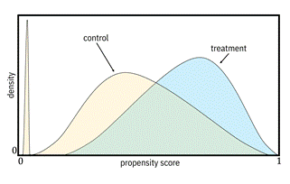
Figure 8.11. Example propensity score distributions; the
one on the left indicates a possible overlap violation, whereas the one on the
right does not. Accessible caption. Plots with density on the vertical axis
and propensity score on the horizontal axis. Each plot overlays a control pdf
and a treatment pdf. The pdfs in the left plot do not overlap much and the
control group distribution has a spike near ![]() . The pdfs in the
right plot are almost completely on top of each other.
. The pdfs in the
right plot are almost completely on top of each other.
The fourth evaluation of a treatment model is the AUC. Although
its definition and computation are the same as in Chapter 6, good values of the
AUC of a propensity score model are not near the perfect ![]() .
Intermediate values of the AUC, like
.
Intermediate values of the AUC, like ![]() or
or
![]() ,
are just right for average treatment effect estimation. A poor AUC of nearly
,
are just right for average treatment effect estimation. A poor AUC of nearly ![]() remains
bad for a propensity score model. If the AUC is too high or too low, do not
proceed with this model. Once you’ve done all the diagnostic evaluations and
none of them raise an alert, you should proceed with reporting the average
treatment effect that you have computed as an actual causal insight. Otherwise,
you have to go back and specify different causal methods and/or machine
learning methods.
remains
bad for a propensity score model. If the AUC is too high or too low, do not
proceed with this model. Once you’ve done all the diagnostic evaluations and
none of them raise an alert, you should proceed with reporting the average
treatment effect that you have computed as an actual causal insight. Otherwise,
you have to go back and specify different causal methods and/or machine
learning methods.
8.5.2 Outcome Models
The other branch of methods you should consider for the
causal model in testing whether ABC Center’s anxiety reduction intervention has
an effect on stable housing is outcome models.
In treatment models, you use the data ![]() to
learn the
to
learn the ![]() relationship,
but you do something different in outcome models. In this branch, you use the
data
relationship,
but you do something different in outcome models. In this branch, you use the
data
![]() to learn the
relationships
to learn the
relationships ![]() and
and ![]() . You’re directly
predicting the average outcome label of stable housing from the possible confounding
variables such as child care along with the anxiety reduction treatment
variable. Strong ignorability is required in both treatment models and outcome
models. Before moving on to the details of outcome models, the difference
between treatment models and outcome models is summarized in Table 8.2.
. You’re directly
predicting the average outcome label of stable housing from the possible confounding
variables such as child care along with the anxiety reduction treatment
variable. Strong ignorability is required in both treatment models and outcome
models. Before moving on to the details of outcome models, the difference
between treatment models and outcome models is summarized in Table 8.2.
Table 8.2. Characteristics of the two branches of causal inference methods.
|
Branch |
Dataset |
What Is Learned |
Purpose |
|
treatment models |
|
|
use to weight the data points |
|
outcome models |
|
|
use directly for average treatment estimation |
Why
is learning ![]() models from data useful?
How do you get the average treatment effect of anxiety reduction on stable
housing from them? Remember that the definition of the average treatment effect
is
models from data useful?
How do you get the average treatment effect of anxiety reduction on stable
housing from them? Remember that the definition of the average treatment effect
is ![]() . Also, remember
that when there is no confounding, the associational distribution and
interventional distribution are equal, so
. Also, remember
that when there is no confounding, the associational distribution and
interventional distribution are equal, so ![]() . Once you have
. Once you have ![]() , you can use
something known as the law of iterated expectations to adjust for
, you can use
something known as the law of iterated expectations to adjust for ![]() and get
and get ![]() . The trick is to
take an expectation over
. The trick is to
take an expectation over ![]() because
because ![]() (The subscripts on
the expectations tell you which random variable you’re taking the expectation
with respect to.) To take the expectation over
(The subscripts on
the expectations tell you which random variable you’re taking the expectation
with respect to.) To take the expectation over ![]() , you sum the
outcome model over all the values of
, you sum the
outcome model over all the values of ![]() weighted by the
probabilities of each of those values of
weighted by the
probabilities of each of those values of ![]() . It is clear
sailing after that to get the average treatment effect because you can compute
the difference
. It is clear
sailing after that to get the average treatment effect because you can compute
the difference ![]() directly.
directly.
You
have the causal model; now on to the machine learning model. When the outcome
label ![]() takes binary
values
takes binary
values ![]() and
and ![]() corresponding the
absence and presence of stable housing, then the expected values are equivalent
to the probabilities
corresponding the
absence and presence of stable housing, then the expected values are equivalent
to the probabilities ![]() and
and ![]() . Learning these
probabilities is a job for a calibrated machine learning classifier with
continuous score output trained on labels
. Learning these
probabilities is a job for a calibrated machine learning classifier with
continuous score output trained on labels ![]() and features
and features ![]() . You can use any
machine learning method from Chapter 7 with the same guidelines for domains of
competence. Traditionally, it has been common practice to use linear
margin-based methods for the classifier, but nonlinear methods should be tried
especially for high-dimensional data with lots of possible confounding
variables.
. You can use any
machine learning method from Chapter 7 with the same guidelines for domains of
competence. Traditionally, it has been common practice to use linear
margin-based methods for the classifier, but nonlinear methods should be tried
especially for high-dimensional data with lots of possible confounding
variables.
Just
like with treatment models, being able to compute an average treatment effect
using outcome models does not automatically mean that your result is a causal
inference. You still have to evaluate. A first evaluation, which is also an
evaluation for treatment models, is calibration. You want small calibration
loss and a straight line calibration curve. A second evaluation for outcome
models is accuracy, for example measured using AUC. With outcome models, just
like with regular machine learning models but different from treatment models,
you want the AUC to be as large as possible approaching ![]() . If the AUC is too
small, do not proceed with this model and go back to step 1 in the iterative
approach to average treatment effect estimation illustrated in Figure 8.10.
. If the AUC is too
small, do not proceed with this model and go back to step 1 in the iterative
approach to average treatment effect estimation illustrated in Figure 8.10.
A
third evaluation for outcome models examines the predictions they produce to
evaluate ignorability or no unmeasured confounders. The predicted ![]() and
and ![]() values coming out
of the outcome models should be similar for clients who were actually part of
the treatment group (received the anxiety reduction intervention) and clients
who were part of the control group (did not receive the anxiety reduction
intervention). If the predictions are not similar, there is still some
confounding left over after adjusting for
values coming out
of the outcome models should be similar for clients who were actually part of
the treatment group (received the anxiety reduction intervention) and clients
who were part of the control group (did not receive the anxiety reduction
intervention). If the predictions are not similar, there is still some
confounding left over after adjusting for ![]() (child care and
other variables), which means that the assumption of no unmeasured confounders
is violated. Thus, if the predicted
(child care and
other variables), which means that the assumption of no unmeasured confounders
is violated. Thus, if the predicted ![]() and
and ![]() values for the
two groups do not mostly overlap, then do not proceed and go back to the choice
of causal model and machine learning model.
values for the
two groups do not mostly overlap, then do not proceed and go back to the choice
of causal model and machine learning model.
8.5.3 Conclusion
You’ve evaluated two options for causal inference: treatment models and outcome models. Which option is better in what circumstances? Treatment and outcome modeling are inherently different problems with different features and labels. You can just end up having better evaluations for one causal method than the other using the different machine learning method options available. So just try both branches and see how well the results correspond. Some will be better matched to the relevant modeling tasks, depending on the domains of competence of the machine learning methods under the hood.
But do you know what? You’re in luck and don’t have to choose between the two branches of causal inference. There’s a hybrid approach called doubly-robust estimation in which the propensity score values are added as an additional feature in the outcome model.[9] Doubly-robust models give you the best of both worlds! ABC Center’s director is waiting to decide whether he should invest more in anxiety reduction interventions. Once you’re done with your causal modeling analysis, he’ll be able to make an informed decision.
8.6 Summary
§ Causality is a fundamental concept that expresses how changing one thing (the cause) results in another thing changing (the effect). It is different than correlation, predictability, and dependence.
§ Causal models are critical to inform decisions involving interventions and treatments with expected effects on outcomes. Predictive associational models are not sufficient when you are ‘doing’ something to an input.
§ In addition to informing decisions, causal modeling is a way to avoid harmful spurious relationships in predictive models.
§ Structural causal models extend Bayesian networks by encoding causal relationships in addition to statistical relationships. Their graph structure allows you to understand what causes what, as well as chains of causation, among many variables. Learning their graph structure is known as causal discovery.
§ Causal inference between a hypothesized pair of treatment and outcome is a different problem specification. To validly conduct causal inference from observational data, you must control for confounding.
§ Causal modeling requires assumptions that are difficult to validate, but there is a set of evaluations you should perform as part of modeling to do the best that you can.